

Crafting a Sustainable & Impactful Brand Identity for AppropriAid NGO
AppropriAid, a German NGO, supports African entrepreneurs in achieving sustainable business growth using local resources and circular production methods. Their mission is to provide access to the European market while ensuring fair compensation for products.
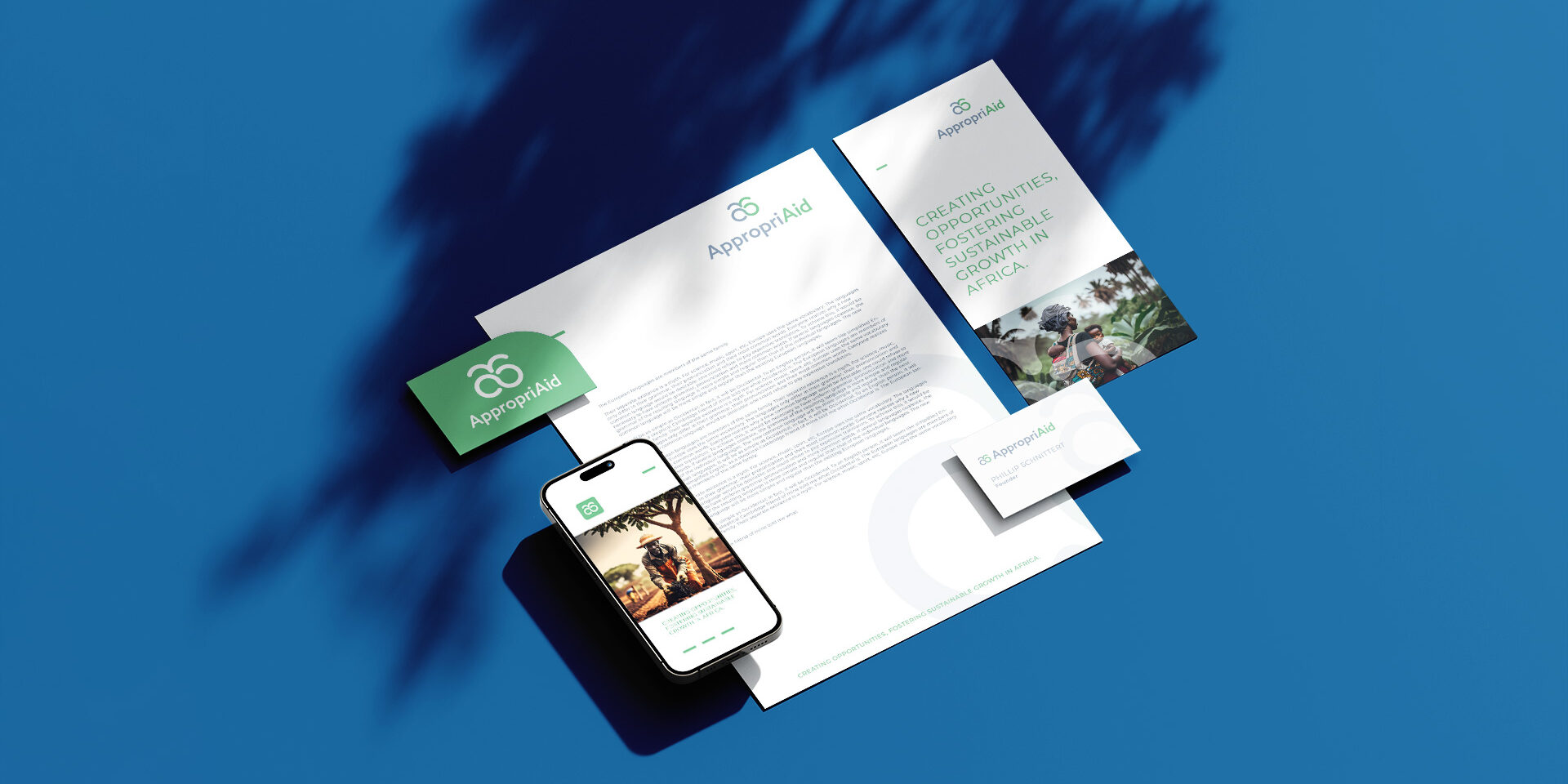
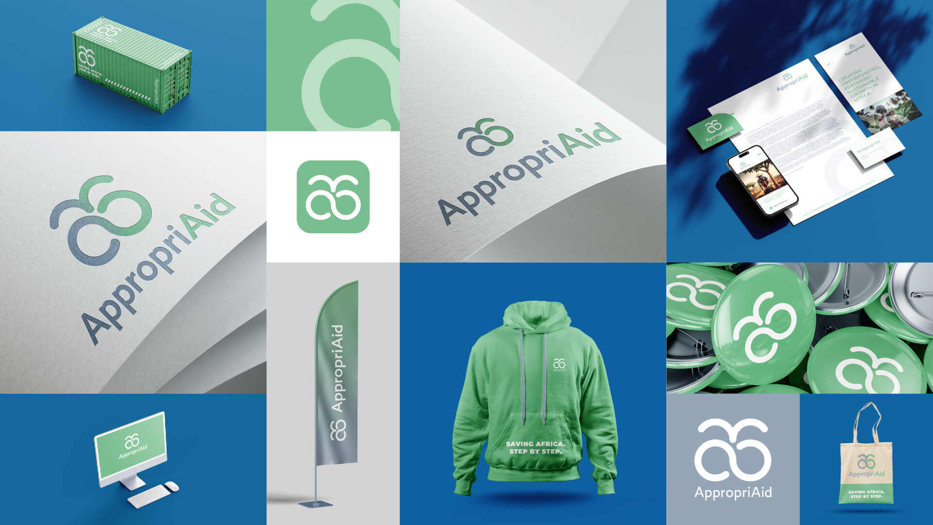
At KTDS, we were tasked with developing AppropriAid’s brand identity, with a focus on circular economy, growth, and sustainability. The brand colors needed to convey a sense of security and nature.
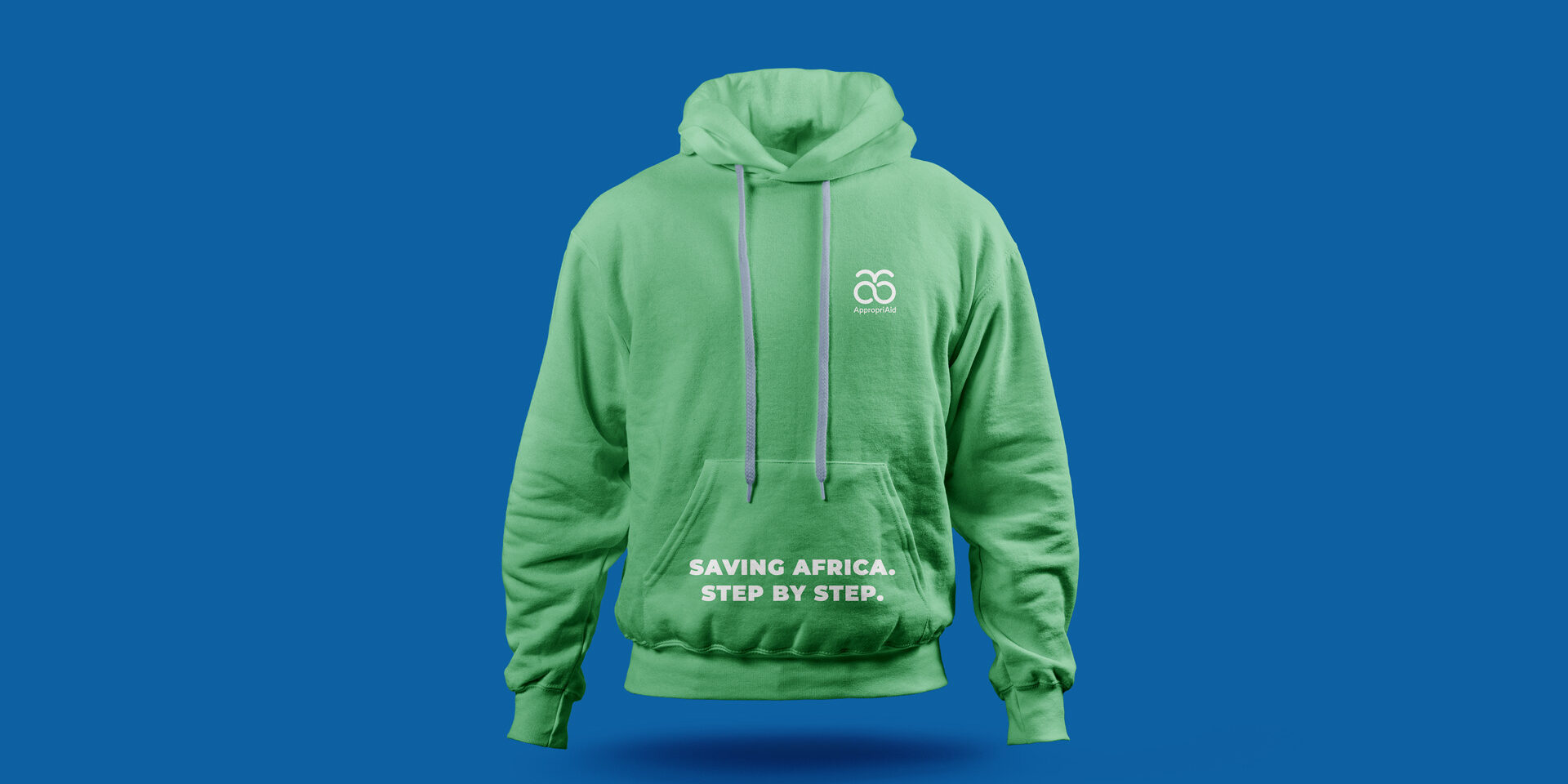
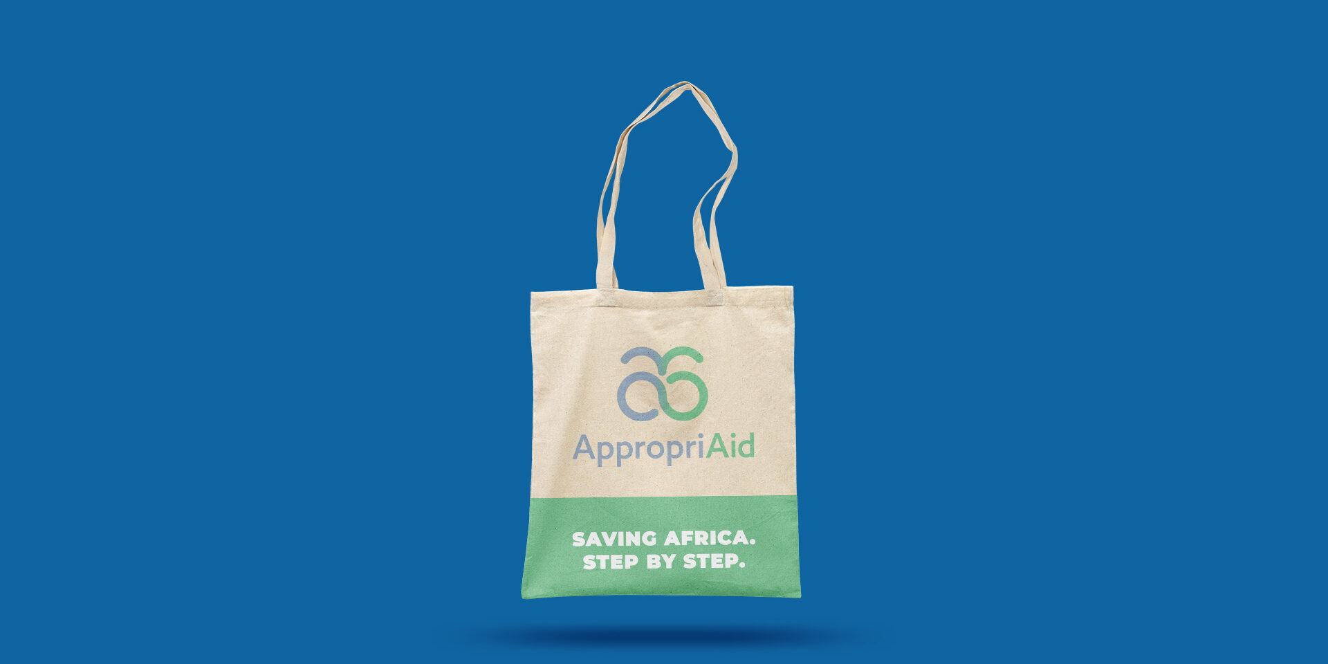
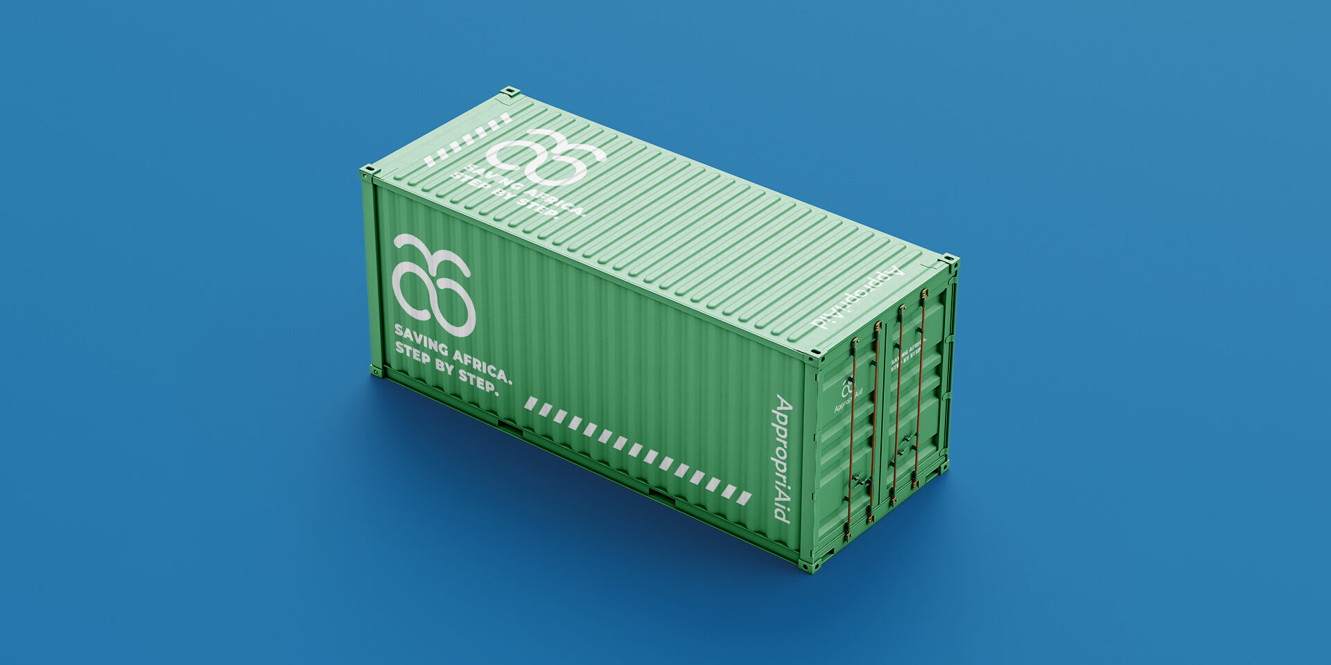
The resulting logo showcases an infinity symbol topped by a fountain, signifying growth, sustainability, and circular production. These elements create back-to-back letters “a,” representing AppropriAid’s initials (AA). The chosen brand colors – bright pastel green and gray-blue – evoke security and naturalness.
We designed a versatile logo with four variations and an icon, suitable for diverse applications, including print layout, web, mobile, displays, and apparel. This adaptability allows the client to use the logo in any orientation, catering to modern advertising spaces, be it horizontal, vertical, or square.
Don’t miss out on the opportunity to build a sustainable and impactful brand for your organization. Contact KTDS today, and let’s create a powerful visual identity together.
A brand is no longer what we tell the consumer it is - it is what consumers tell each other it is.

Related Projects.